纯 CSS 实现十个还不错的 Loading 效果
在推特上面看到 T. Afif[1] 介绍的十个 Loading 效果。如上图。
Yeah,很赞哦,挺实用的,遂记录下来。
为保证运行正常,咱先规定下:
* {
  box-sizing: border-box;
}
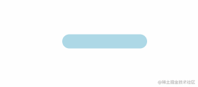
1、平滑加载

<div class="progress-1"></div>
.progress-1 {
  width: 120px;
  height: 20px;
  background: linear-gradient(#000 0 0) 0/0% no-repeat #ddd;
  animation: p1 2s infinite linear;
}
@keyframes p1 {
  100% {
    background-size: 100%;
  }
}
1.linear-gradient(#000 0 0) 你可以理解为 linear-gradient(#000 0 100%),如果还不熟悉,复制 linear-gradient(#000 0 50%, #f00 50% 0) ,替换原先的部分跑一下。觉得 linear-gradient(#000 0 0) 别扭的话,直接写 #000 即可。
2.0/0% 是 background-position: 0;/background-size: 0; 的简写。
2、按步加载
<div class="progress-2"></div>
.progress-2 {
  width: 120px;
  height: 20px;
  border-radius: 20px;
  background: linear-gradient(orange 0 0) 0/0% no-repeat lightblue;
  animation: p2 2s infinite steps(10);
}
@keyframes p2 {
  100% {
    background-size: 110%;
  }
}
steps(10)是step(10, end)的简写,指明刚开始没有,所以有第 2 点的处理100% {background-size:110%}添加多一个step的百分比,上面的step是10,所以是100% + (1/10)*100% = 110%
3、条纹加载

<div class="progress-3"></div>
.progress-3 {
  width: 120px;
  height: 20px;
  border-radius: 20px;
  background: repeating-linear-gradient(135deg, #f03355 0 10px, #ffa516 0 20px) 0/0%
      no-repeat, repeating-linear-gradient(135deg, #ddd 0 10px, #eee 0 20px) 0/100%;
  animation: p3 2s infinite;
}
@keyframes p3 {
  100% {
    background-size: 100%;
  }
}
repeating-linear-gradient(135deg,#ddd 0 10px,#eee 0 20px) 0/100%; 画出灰色的斑马线条纹,repeating-linear-gradient(135deg,#f03355 0 10px,#ffa516 0 20px) 0/0% no-repeat 则是进度条加载的条纹。
4、虚线加载
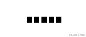
<div class="progress-4"></div>
.progress-4 {
  width: 120px;
  height: 20px;
  -webkit-mask: linear-gradient(90deg, #000 70%, #0000 0) 0/20%;
  background: linear-gradient(#000 0 0) 0/0% no-repeat #ddd;
  animation: p4 2s infinite steps(6);
}
@keyframes p4 {
  100% {
    background-size: 120%;
  }
}
-webkit-mask 默认有值 repeat,不然遮罩不会有五个。
5、电池加载
<div class="progress-5"></div>
.progress-5 {
  width: 80px;
  height: 40px;
  border: 2px solid #000;
  padding: 3px;
  background: repeating-linear-gradient(90deg, #000 0 10px, #0000 0 16px) 0/0% no-repeat
    content-box content-box;
  position: relative;
  animation: p5 2s infinite steps(6);
}
.progress-5::before {
  content: "";
  position: absolute;
  top: 50%;
  left: 100%;
  transform: translateY(-50%);
  width: 10px;
  height: 10px;
  border: 2px solid #000;
}
@keyframes p5 {
  100% {
    background-size: 120%;
  }
}
原作者对 .progress-5::before 伪元素实现如下:
.progress-5::before {
  content: "";
  position: absolute;
  top: -2px;
  bottom: -2px;
  left: 100%;
  width: 10px;
  background: linear-gradient(
        #0000 calc(50% - 7px),
        #000 0 calc(50% - 5px),
        #0000 0 calc(50% + 5px),
        #000 0 calc(50% + 7px),
        #0000 0
      ) left / 100% 100%, linear-gradient(
        #000 calc(50% - 5px),
        #0000 0 calc(50% + 5px),
        #000 0
      ) left / 2px 100%,
    linear-gradient(#0000 calc(50% - 5px), #000 0 calc(50% + 5px), #0000 0) right/2px
      100%;
  background-repeat: no-repeat;
}
#0000 是透明,同等 transparent
6、内嵌加载
这名字起得有些不贴切,不过不重要,读者看图自然理解。
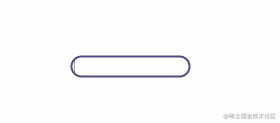
<div class="progress-6"></div>
.progress-6 {
  width: 120px;
  height: 22px;
  border-radius: 20px;
  color: #514b82;
  border: 2px solid;
  position: relative;
}
.progress-6::before {
  content: "";
  position: absolute;
  margin: 2px;
  inset: 0 100% 0 0;
  border-radius: inherit;
  background: #514b82;
  animation: p6 2s infinite;
}
@keyframes p6 {
  100% {
    inset: 0;
  }
}
inset:0 100% 0 0; 右边内缩 100%,所以在 keyframes 部分需要将 inset 设置为 0。
7、珠链加载

<div class="progress-7"></div>
.progress-7 {
  width: 120px;
  height: 24px;
  -webkit-mask: radial-gradient(circle closest-side, #000 94%, #0000) 0 0/25% 100%,
    linear-gradient(#000 0 0) center/calc(100% - 12px) calc(100% - 12px) no-repeat;
  background: linear-gradient(#25b09b 0 0) 0/0% no-repeat #ddd;
  animation: p7 2s infinite linear;
}
@keyframes p7 {
  100% {
    background-size: 100%;
  }
}
遮罩 -webkit-mask 中 radial-gradient 是将宽度四等份,每份以最小 closest-side 的边为直径画圆。
8、斑马线加载

<div class="progress-8"></div>
.progress-8 {
  width: 60px;
  height: 60px;
  border-radius: 50%;
  -webkit-mask: linear-gradient(0deg, #000 55%, #0000 0) bottom/100% 18.18%;
  background: linear-gradient(#f03355 0 0) bottom/100% 0% no-repeat #ddd;
  animation: p8 2s infinite steps(7);
}
@keyframes p8 {
  100% {
    background-size: 100% 115%;
  }
}
对 linear-gradient 描绘的角度做调整,再加上蒙版。
9、水柱加载

<div class="progress-9"></div>
.progress-9 {
  --r1: 154%;
  --r2: 68.5%;
  width: 60px;
  height: 60px;
  border-radius: 50%;
  background: radial-gradient(
        var(--r1) var(--r2) at top,
        #0000 79.5%,
        #269af2 80%
      ) center left, radial-gradient(
        var(--r1) var(--r2) at bottom,
        #269af2 79.5%,
        #0000 80%
      ) center center,
    radial-gradient(var(--r1) var(--r2) at top, #0000 79.5%, #269af2 80%) center
      right, #ccc;
  background-size: 50.5% 220%;
  background-position: -100% 0%, 0% 0%, 100% 0%;
  background-repeat: no-repeat;
  animation: p9 2s infinite linear;
}
@keyframes p9 {
  33% {
    background-position: 0% 33%, 100% 33%, 200% 33%;
  }
  66% {
    background-position: -100% 66%, 0% 66%, 100% 66%;
  }
  100% {
    background-position: 0% 100%, 100% 100%, 200% 100%;
  }
}
radial-gradient 画出水平面的波动,就三个圆。var(--r1) 直接调用定义好的属性值。技能 get …
10、信号加载

<div class="progress-10"></div>
.progress-10 {
  width: 120px;
  height: 60px;
  border-radius: 200px 200px 0 0;
  -webkit-mask: repeating-radial-gradient(
    farthest-side at bottom,
    #0000 0,
    #000 1px 12%,
    #0000 calc(12% + 1px) 20%
  );
  background: radial-gradient(farthest-side at bottom, #514b82 0 95%, #0000 0) bottom/0%
    0% no-repeat #ddd;
  animation: p10 2s infinite steps(6);
}
@keyframes p10 {
  100% {
    background-size: 120% 120%;
  }
}
用 repeating-radial-gradient 方法画出环状的蒙版遮罩。radial-gradient 从底部向上圆形渐变填充。
Uha,看了这么多骚操作,你学废了吗?
参考和后话
- 原文:10 CSS-only loaders ready to use![2]
参考资料
[1] T. Afif: https://twitter.com/ChallengesCss
[2] 10 CSS-only loaders ready to use!: https://twitter.com/ChallengesCss/status/1500437014616940546?cxt=HHwWhIC5gfzgz9IpAAAA